I really like how just one letter has been used for the whole composition and the variety has been created by altering the sizes and rotating each element.
The way this artwork has been composed is so intricate and the way the words form the image of the girl and the different tones looks amazing up close and as a whole.
I love how these images create a connection between the fake and real world. The black background draws you in to the work. They also have a real sense of texture.
Ivar Hagendoorn uses Arabic text as a starting point and transforms them into beautiful graphic design pieces. I especially like the combination or red and black in the first composition.
Ed Fella has a wide variety of techniques that he uses for his graphic design work. I really like the hand drawn quality that these particular works have and the use of the watercolours too.
The colours used have a strong impact and the way these images have been composed is very interesting. I love the amount of detail each piece has which then makes up the whole composition.
For my studio project I looked at different installation works and found this one of interest because of the way that the lights transform the space and experience for the visitor.
This installation is one of my favourites which I came across when researching lighting and how they can be used on their own and then as a whole and how these two conditions are quite different.
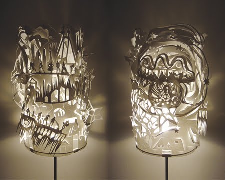
When researching different ways of creating forms and space I found these beautiful lamps. They are all handmade from a single sheet of paper. I was amazed by the level of detail and the lovely shadows these pieces created!


